A Few of Our Favorite Things: LL’s Photographers
06/04/2015Erik Johansson
http://erikjohanssonphoto.com
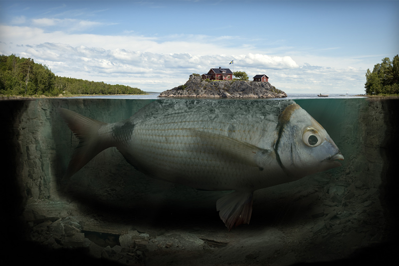
I love Erik Johansson’s work for its surrealist quality and painterly feel. A single piece of his work might actually contain hundreds of different images, yet his goal is still for it to look like it was all captured in 1 shot. Johansson says he takes a problem-solving approach to his work, collecting material to convey an idea. As a graphic artist, I can relate and appreciate this approach as I use it everyday in my work as well. While Johansson considers his personal work to be closest to his heart, he has created work for some major companies such as Google, Adobe, and Microsoft. I highly suggest checking out some of his work; it’s really exciting to look at from an artistry perspective.

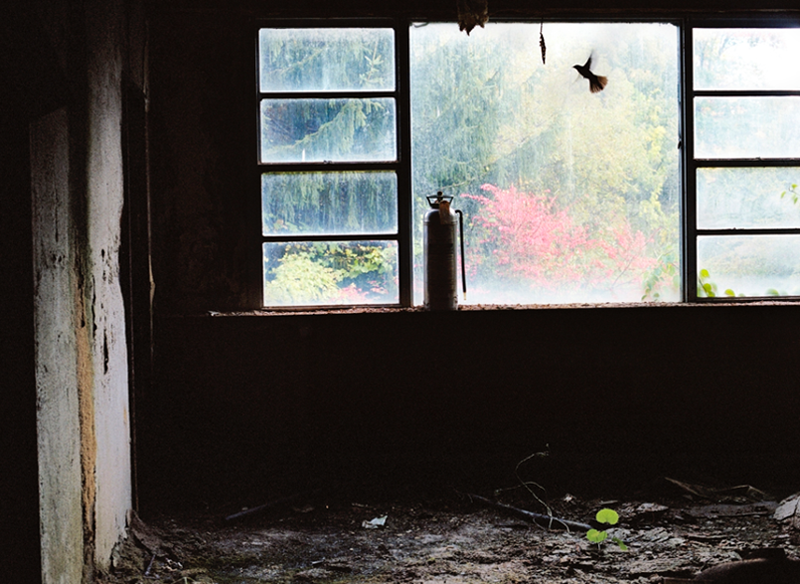
Guest Room, Grossinger’s Catskill Resort and Hotel, Liberty, NY by Marisa Scheinfeld http://www.marisascheinfeld.com
Marisa Scheinfeld
http://www.marisascheinfeld.com
Marisa Scheinfeld’s series called “Echoes of the Borscht Belt” is comprised of images depicting the fallout and decay of hotels and resorts that once thrived in the Catskills. I have a love for photographers who capture the remains of old buildings. There’s something about that lost history… How little, everyday items that were just set down years ago become abandoned and forgotten, only to become clues about what had been… and how nature takes over what had been man-made. I just find it so interesting to look at. I think Scheinfeld captures this scene so well; she has a connection with the area, visiting often as a young girl. If you find yourself intrigued with Scheinfeld’s work, also check out Christopher Payne and his Asylum or North Brother Island series.
Clarissa Bonet
http://www.clarissabonet.com
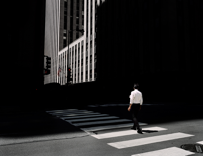
Her use of shadow is so perfect. The work has a sort of mystery about it. I love the silhouettes of people and the way she stays away from showing faces. The city setting also makes you think about how often we rush past people without even noticing those around us. I enjoy the graphic elements present in many of her pieces, creating patterns in the city with everyday elements already there like high rise windows, paint splatters on walls, street walkways, and rain. I get this sort of loneliness even when you know the setting is full of people. Her series “Dark City” has this great pattern/textile feel to it, expertly using lit up windows at night.
Posted in: A Few of Our Favorite Things
Tagged: artists | Clarissa Bonet | Erik Johansson | favorite things | inspiration | LL's | Marisa Scheinfeld | photography


