Design Trends: Memphis
10/25/2018Put yourself back in the 1970s. Imagine the minimalist, straight and structured design that fit the status quo. Now enter Ettore Sottsass, a designer from Milan, Italy who gathered up a group of designers and architects for the sole purpose of breaking every rule about “good” design. They called themselves the Memphis Group.
You may be asking yourself why the trend is called “Memphis” if it was created in Italy. They took their name from the Bob Dylan song Stuck Inside of Mobile with the Memphis Blues Again. This song played over and over again during their first meeting.
This rebellious movement celebrated the unrestricted and free-spirited exploration of creative design. They wanted to shift their thinking to be “radical, funny and outrageous.”
Features of Memphis Design:
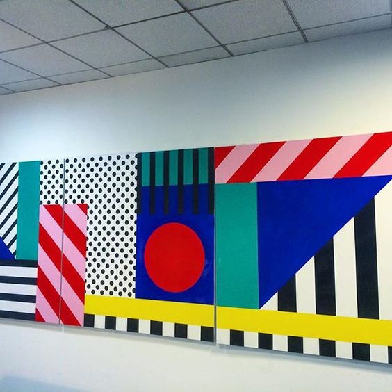
- Geometric elements that resemble Art Deco
- Colorful pallet of Pop Art
- 1950s kitch aesthetic
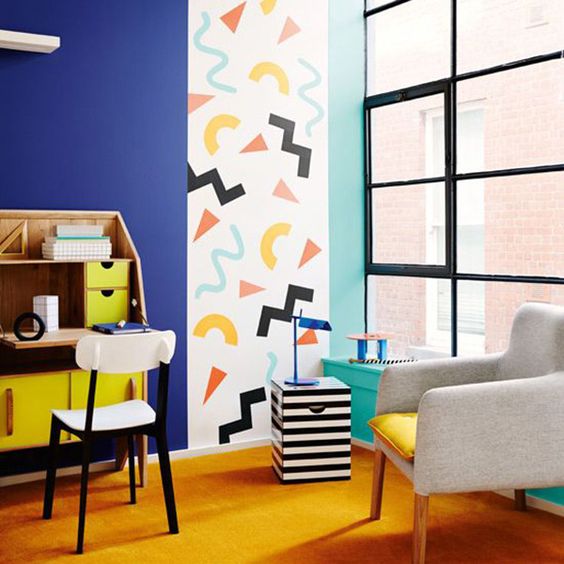
- Squiggles!
This style was particularly popular in interior design. Laminate and Terrazzo materials were used on tables and lamps instead of floors, and there was typically a rejection of usual shapes. For example, designers of this style favored circles or triangles for the legs of chairs. It was all about reversing the norm.
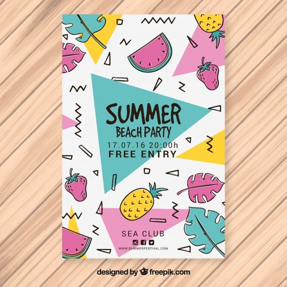
The Memphis style can be quite powerful when used in graphic design. It can easily turn something from bland or standard into popping and eye-catching.
Typography
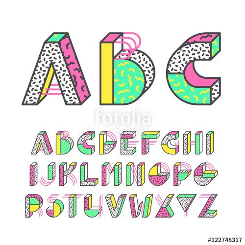
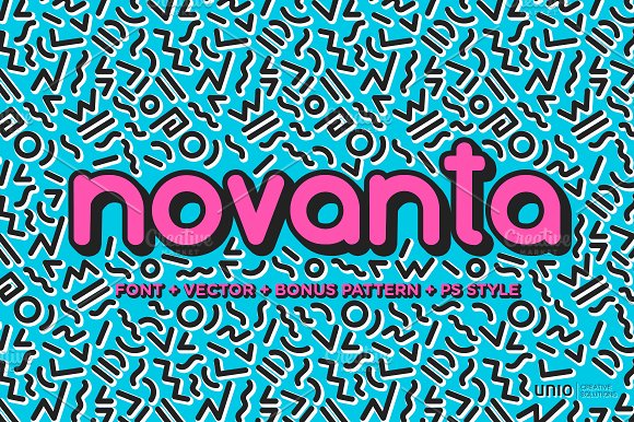
Good font choices for Memphis designs typically have a geometric feel, but also utilize curved edges. Think Art Deco that will compliment this style’s geometric and chaotic tone.
Patterns
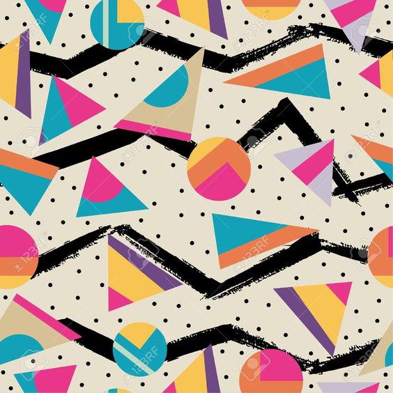
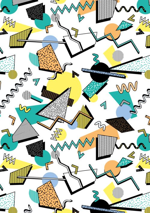
The Memphis style truly embraced chaos backgrounds in a sense that thin straight lines are in stark contrast with thick, organic, unaligned structures and 3D shapes. Thinking playfully and child-like will help guide the design.
Colors
As you’re thinking dynamic, joyful colors anything goes with Memphis! Many examples show colored shapes (usually light pastel colors) on pure white, but that isn’t always the case. There are plenty of examples on black or other colored backgrounds as well.
Memphis is overall a very fun style of design to use. I love how reminiscent the style is to that of children’s finger painting with how chaotic and unrestrained it is. Sometimes it’s really fun to break the rules!
Sources: https://mymodernmet.com/what-is-memphis-design/ | https://creativemarket.com/blog/trend-alert-1980s-memphis-design
—
Kaylee Wolff
Posted in: Design
Tagged: chaotic | colorful | design | design trend | free-spirit | memphis | rebellious design | squiggles | trend

