Encounters with Color
11/20/2018I was out and about with friends when halfway through the day, we noticed that almost everyone had green on. This sparked a hot debate about color (and color theory). Continue reading …
Yoga benefits you can apply at work
11/14/2018All jobs come with unique stressors. Deadlines, customer service or even co-workers can make you feel a bit drained at the end of the day.
A couple years ago, I wanted give yoga try. Initially, my goal was to increase strength and flexibility. After some searching, I came across Yoga with Adriene on Youtube. Adriene has a light-hearted and educated approach to the practice. Bonus: It was free, and I could practice in my living room.
In January of 2018, I completed Adriene’s True 30 Day Yoga Journey. I showed up on the mat every day without fail. I scheduled the time and made it a priority. While I did become more flexible and strong, I noticed bigger overall changes: Continue reading …
Design Trends: Memphis
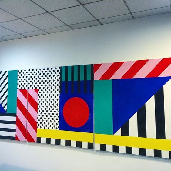
10/25/2018Put yourself back in the 1970s. Imagine the minimalist, straight and structured design that fit the status quo. Now enter Ettore Sottsass, a designer from Milan, Italy who gathered up a group of designers and architects for the sole purpose of breaking every rule about “good” design. They called themselves the Memphis Group.
You may be asking yourself why the trend is called “Memphis” if it was created in Italy. They took their name from the Bob Dylan song Stuck Inside of Mobile with the Memphis Blues Again. This song played over and over again during their first meeting.
This rebellious movement celebrated the unrestricted and free-spirited exploration of creative design. They wanted to shift their thinking to be “radical, funny and outrageous.”
Connecting Naturally To Design
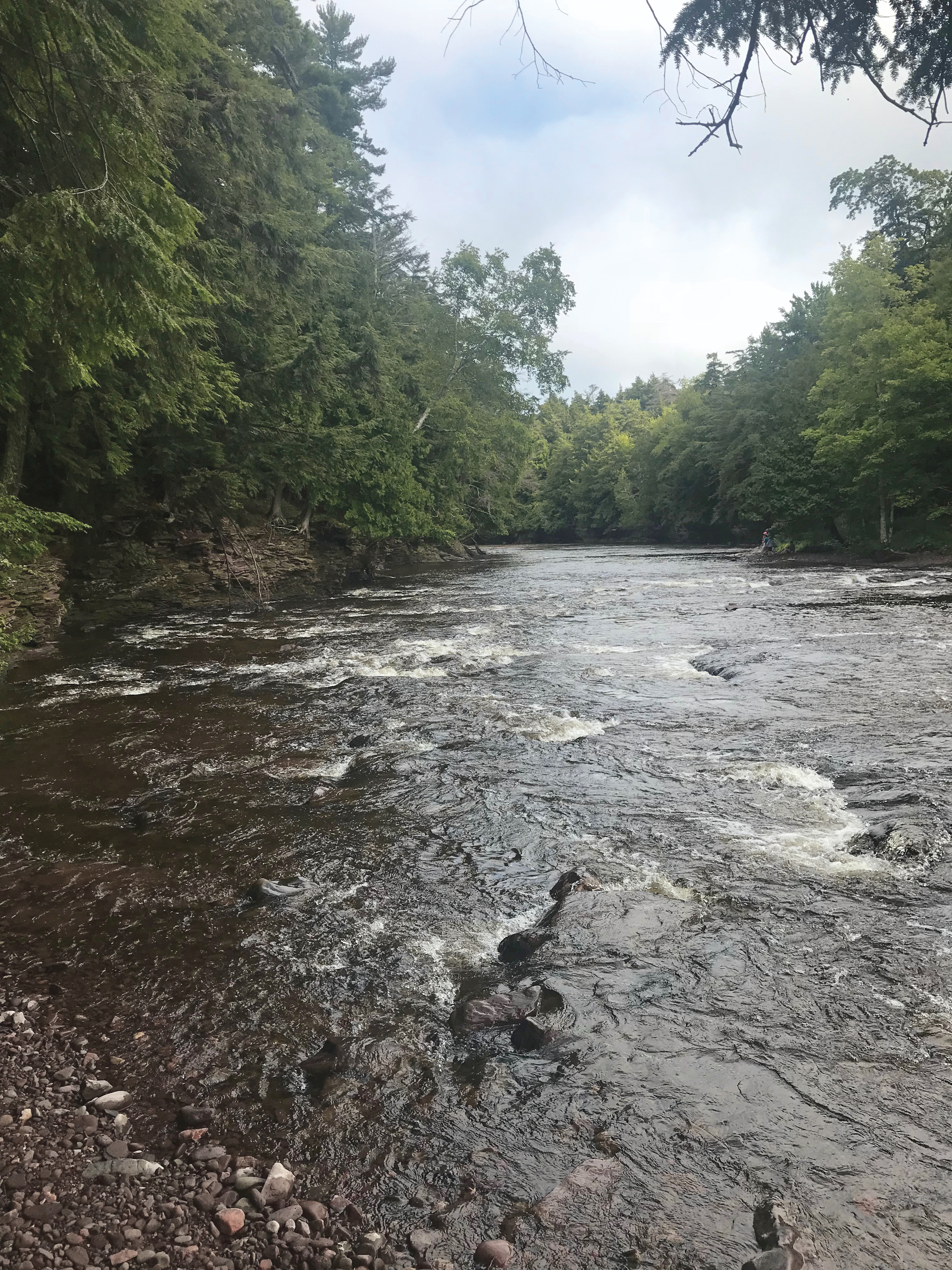
10/10/2018Lake of the Clouds, Michigan / Lake Superior
In a nutshell, graphic designers create. We live by a digital code. However, in this age fueled by social media and a lightning-fast internet, the most important sources of inspiration are often taken for overlooked.
As we produce more, swipe more, tag more, post more, the connection with our environment and planet drifts quietly away. We see through our screens rather than taking in all that surrounds us. We seem to almost forget that the earth itself has provided us with everything we need to survive: food, water, shelter, oxygen. Visual and artistic inspiration is less basic but also extremely important.
Design is in the details; the details are in the design. Interesting enough, nature provides that for us, as long as we are interested and know where to look. It may require some exploration, but taking in nature’s beauty has proven to be an extremely worthwhile and beneficial task to undertake.
Take, for instance, a recent trip I took to the Upper Peninsula of Michigan with a group of good college friends. As we pushed north, cell service became more sporadic and then was not to be found. Before we finally arrived on the shores of Lake Superior, I’d almost forgotten places like this existed. Serene and quiet, filled with vibrant colors and environment, the elements of design were all around, creating an intricate and beautiful piece for our eyes.
It’s beginning to feel a lot like fall. The leaves are changing, the air is getting crisp, and that means it is time to celebrate with… China Lights! I love new experiences, and the lights, atmosphere, colors, entertainment—everything here is fantastic.
The walking tour starts right when you enter at the gates. There are 45 exhibits laid out perfectly in the garden grounds. Each display teaches you a little more about the Chinese culture and the lantern festivals that are celebrated all across Asia.The show depicts art, skill, and beauty combined.
It’s amazing how the lights and fabric project differently for each display. Some were soft and calming, while others were loud and energetic. With every turn of a corner, my anticipation and excitement grew as I waited to see what display was up next!
Inspiration Destination: Miller Park
10/02/2018I love baseball.
As a child, I can still remember the excitement I’d feel riding in the car with my dad to a Brewers game, looking out the window, anticipating the moment when Milwaukee County Stadium would emerge from behind the trees along Bluemound Road or I-94.
Even now, as an adult taking my own kids to games, I still get that little twinge of anticipation every time that initial glimpse of Miller Park’s pale, green roof and red brick façade clears the trees on that same stretch of road I’ve traveled so many times before.
I have begun to realize that more than just the game itself, it’s the details—the sounds, the smells, the colors—that build my excitement, even after all these years.
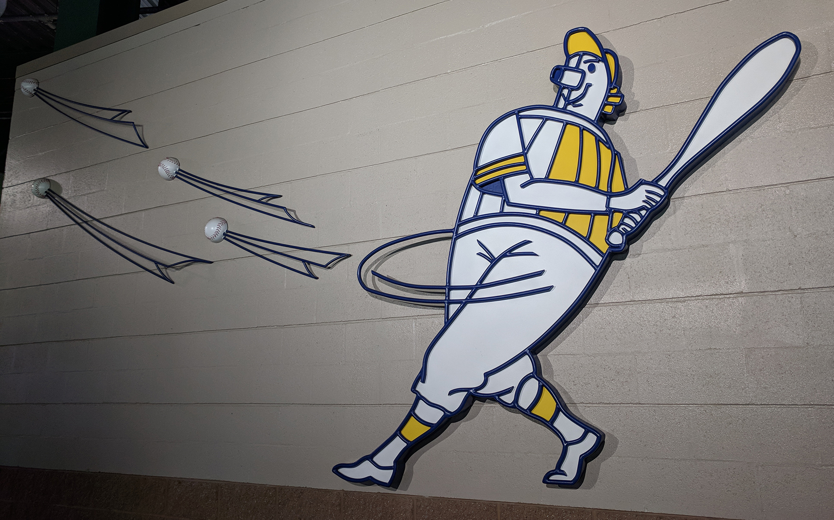
I was at a game recently with my wife and kids, and as we were walking the dark cement concourses, I began to notice just how much there was to look at, before even sitting down to watch the game.
Inspiration Destination: Chihuly at Biltmore
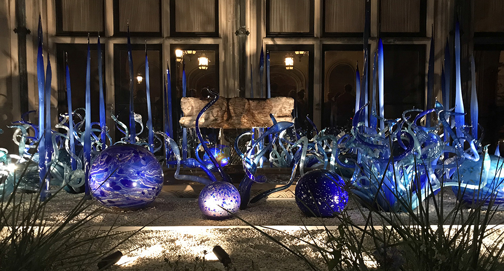
09/19/2018Dale Chihuly is an artist and glass blower that pushes the limits of his medium to create organic and asymmetrical pieces of art. He is celebrated for large architectural installations.
“I want people to be overwhelmed with light and color in some way that they’ve never experienced.”
– Dale Chihuly


